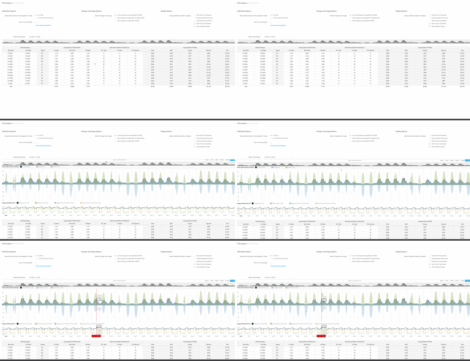
Demand Profile Visualization
The 'Demand Profile Visualization' module is accessible by clicking into the graph seen in the middle of the analytics window. It is an interactive charting environment that allows users to visualize their customer’s interval data, including usage data, solar PV production data, EES charge/discharge data, and net usage data. Users can select a monthly data range by clicking on the desired date in the 'Monthly Electricity Costs' table below the graph.

The demand profile visualization is an elegant and intuitive dynamic graph that allows the user to view overlaying 15-minute interval load profiles, with power [Kw] measured on the vertical axis plotted against time on the horizontal axis, and display the following data:
- Current Demand [Dark Blue]: Load curve of power being supplied by the grid to the selected facility meter pre-solar, which the project is aiming to offset. This is derived from the consumption data that was uploaded when the facility’s Energy Use Profile (EUP) was created.
- Net Demand [Light Blue]: Projected load curve of power supplied to the selected facility meter after solar PV and/or Storage has been added. When net demand is negative, this represents power being exported to the grid.
- Solar PV power [Green]: Represents the power being produced by the PV system.
- Battery power [Orange]: Represents the charge/discharge (Dispatch) strategy of the ESS system. When the Battery power is negative, the battery is charging. Battery power labeled as a positive value represents a discharge.
- Battery State-of-Charge (S.O.C) [Red Line]: The remaining available charge in the battery, measured on a scale from 0.00 - 1.00 (.75 would represent 75% state of charge(SoC)).
Viewing Utility Rate Costs
Directly below the load profiles is a graphical view of the utility rate tariff(s) applicable to the project, broken out into energy and demand prices (which would vary depending on the rate(s) being used). The value displayed for the rate tariff graphs measures either the energy or demand price in currency at the selected 15-minute interval on the horizontal axis. If the user has selected a new rate for the project to switch to, the breakout of charges for both rates will be displayed.
Mouse gestures & actions on the chart:
- Hovering the mouse over the chart displays selected data types at any given 15 min interval, which can be seen on the bottom in red.
- Click, hold & drag on the chart, which creates a highlight, to zoom in for a more granular view. Or choose a zoom range on the top-right of the chart. Similarly, click, hold, and drag the load profile silhouette left or right to move through the selected billing range by a certain block of time. You can set this block of time by dragging the circles on either side.
- Toggle On or Off legend values by clicking on their respective colored squares to display or not display that data type on the chart.