Storage Capacity Optimizer
Overview
The Storage Capacity Optimizer for Energy Storage Systems (ESS) is located in the ESS Details modal. Users can access this window:
-
When first adding an ESS System to a proposal.
-
By clicking any of the ESS summary values on the Edit Proposal screen.
This tool helps optimize storage capacity by analyzing system ratings, energy savings, demand savings, and other key metrics.
Generic Simulations:
-
-
Defaults:
-
Minimum power rating: Greater of 5kW or 5% of maximum demand.
-
Maximum power rating: Greater of 15kW or 150% of maximum demand.
-
Discharge Duration defaults to 2 hours.
-
-
Grey Sliders:
-
Adjust capacity, discharge duration, and simulation count.
-
Customize the chart scale and drill down into specific power rating windows or discharge duration lengths.
-
-
Selected Model Simulations:
-
-
Defaults:
-
Users must select an ESS design before running the optimizer.
-
The chart defaults to displaying 5 systems but can be adjusted between 1 and 10 systems.
-
-
Grey Sliders:
-
Adjust system quantity and simulation count.
-
-
Note:
-
Results depend on hardware and model selected on the left side of the screen
-
-
Variables the 'Storage Capacity Optimizer' references: Energy Toolbase runs each ESS simulation independently, referencing the following variables:
- Energy Use Profile: usage data & metering specifications.
- Control Settings Info: selected control strategies Dynamic or Fixed.
- Utility rate schedules: both ‘Current’ and ‘new' and any NEM 2.0 specifications.
- ESS System Characteristics: kWh Energy Capacity, kW Max Power, Max Charge Power, Max Depth of Discharge, Discharge Efficiency, Charge Efficiency, Battery Degradation Rate.
Charts Displayed: The Storage Capacity Optimizer simulates 5 different sized ESS systems by default, which are proportionally spaced, displayed on the x-axis of each chart in DC Power Rating (kW) / Capacity Rating (kWh) - units. The optimizer outputs six separate interactive charts.
-
Energy Savings displays the energy-only savings or '$/kWh' portion of bill savings only.
-
Demand Savings: displays the demand-only savings or '$/kW' portion of bill savings only.
-
Electric Bill Savings: displays the total utility bill savings in dollars, which is the energy savings + ‘demand savings.’
-
Blended Savings: displays the blended ($/kWh) savings or ‘value of solar
-
Annual Peak Demand: displays the post-ESS Max Annual (kW) demand.
-
Exported Generation: displays the 1st year exported (kWh) generation and 1st year % of generation exported to the grid.
Reading/interpreting the charts:
No rate switching: if the user does not define a rate switch in the rate schedule details, then only one line will be displayed on the chart.
Rate switching: if the user defines a rate switch in the rate schedule details, there will be a '$' icon at the top right of the chart, when this is toggled, (2) separate lines will be displayed on each chart depicting projected savings on the current rate tariff and projected savings a new rate tariff
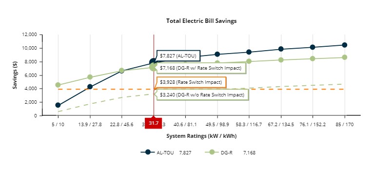
- "Current rate" savings (Solid Dark Blue): the dollar savings the corresponding system would achieve if the system is installed and the customer were to remain on the 'Current Rate.'
- "'New rate' w/ Rate Switch Impact" savings (Solid Green): the dollar savings the system will achieve if the system is installed and the customer were to undergo a switch to the 'New Rate.'
- "'New rate' - w/o Rate Switch Impact" savings (Dashed Green): the would-be savings achieved by the system moving if the customer had already been on the new rate being switched to. The value is equal to "'New rate' w/ Rate Switch Impact" (Solid Green) minus the value of the "Rate switch impact" (Dashed Orange).
-
"Rate switch impact" only savings (Dashed Orange): the cost or savings that would result from the customer's rate switch, without the addition of solar or storage and the current level of electricity utilization remaining constant. (Utility Bill (on current rate) - Utility Bill (on new rate)).
- *Note: a negative number represents higher utility bill costs on the 'New Rate,' while a positive number represents lower utility bill costs on the 'New Rate.'
Mouse gestures & actions on the chart:
- Hovering the mouse over any point on the chart to see the given system size's exact value.
- Click, hold, drag & release on the chart to zoom in on a tighter range, which will re-simulate the Mix & Max range on all the charts.
- Click once on any point on the chart to populate that sized system into the ‘Edit PV Array’ inputs above. This applies whether the user selected a ‘Simple’ or ‘Detailed’ array type.