Rate Switching Display Charts Explained
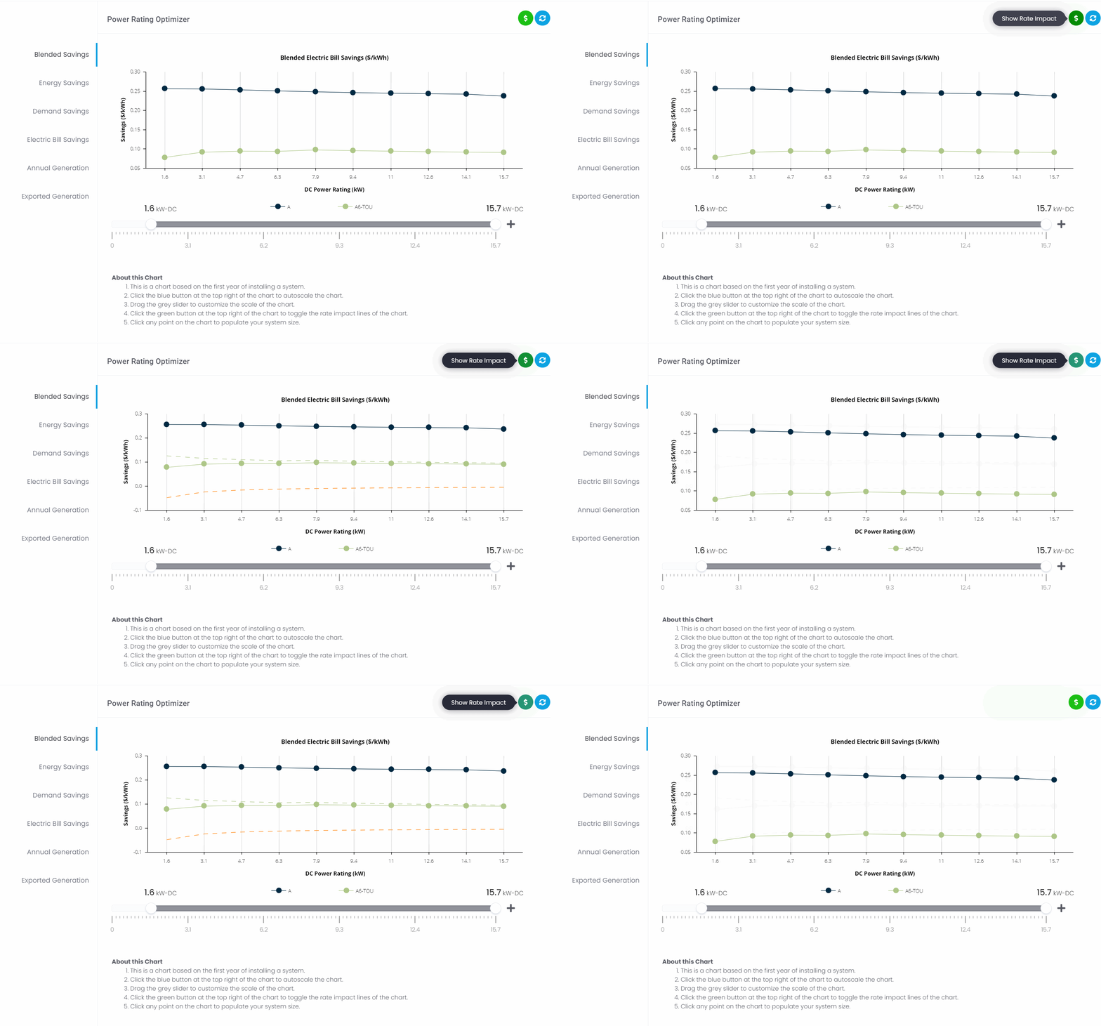
When running the ETB Optimizers, if you define a utility rate switch, then (4) separate lines can be displayed on each optimization chart. To add the additional chart lines, the user must toggle the green '$' icon at the top right of the chart to show the rate switch impact graphs.

Power Rating Optimizer chart:
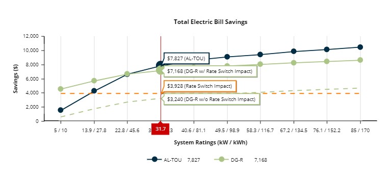
Storage Capacity Optimizer chart:
"Current rate" savings(Solid Dark Blue): the dollar savings the corresponding system would achieve if the system is installed and the customer were to remain on the 'Current Rate.'
"'New rate' w/ Rate Switch Impact" savings (Solid Green): the dollar savings the system will achieve if the system is installed and the customer were to undergo a switch to the 'New Rate.'
"Rate switch impact" only savings (Dashed Orange): the cost or savings that would result from the customer's rate switch, without the addition of solar or storage and the current level of electricity utilization remaining constant. (Utility Bill (on current rate) - Utility Bill (on new rate)).
*Note: a negative number represents higher utility bill costs on the 'New Rate,' while a positive number represents lower utility bill costs on the 'New Rate.'
"'New rate' - w/o Rate Switch Impact" savings (Dashed Green): this value represents the savings achieved from the system if the customer had already been on the new rate being switched to. The value is equal to "'New rate' w/ Rate Switch Impact" (Solid Green) minus the value of the "Rate switch impact" (Dashed Orange).
Show Rate Switch Impact: we felt it would be most transparent to allow our users to not only graphically view the realized dollar savings of a simulated PV system but also view any potential avoided cost that is derived purely from the act of switching rates, which we refer to as the "Rate Switch Impact." When negative, the Rate Switch Impact can be thought of as the rate switch's hidden or soft-cost. When positive, it can be thought of additional savings achieved when switching rates, not resulting from system production.
This way, you can identify where the total savings come from in instances where the customer rate switches and best translate the project's savings to close the sale. To put it plainly, if you have ever been asked by a customer, “How do I know if I am saving money from the new system you are installing, or if it's from the rate switch?” this feature will allow you to answer that question quickly. See the following case study:

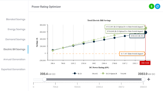
Let’s assume that the asset owner of the project represented above is in the position where they will have no choice but to move the site from the Current Rate (DARK BLUE) to the New Rate (GREEN).
"Current rate" savings [Solid Blue ]: the dollar savings the corresponding PV system would achieve if the system is installed and the site were to remain on the Current Rate. In this example, it is $584,402
"New rate with (w/) Rate Switch Impact" savings [Solid Green]: the dollar savings the PV system will achieve if the system is installed and the site was to undergo a rate switch. On the Electric Bill Savings chart, the number displayed is the annual savings on the proposal document. In this example, it is $704,648
"Rate Switch Impact"[Dashed Orange]: the cost or savings that would result from the customer's rate switch, without the addition of solar or storage and the current level of electricity utilization remaining constant. In this scenario, this is a soft-cost that will be incurred when switching rates. In this example, it is $-17,447
"New rate – without (w/o) rate switch impact" [Dashed Green]: the savings achieved from the system if the customer had already been on the new rate being switched. In this example, it is $722,095. After the soft-cost from the mandatory Rate, Switch Impact is added, the customer is presented with total system savings ("New rate with (w/) Rate Switch Impact").

